
5+ Website Background Effects: Liquid Gradients, Aurora, and Ambient Backgrounds
Animated liquid gradient backgrounds, aurora hero effects, mesh gradient backdrops, and ambient WebGL canvases for AI product pages, landing sections, and modal backdrops. Build with Claude Code, Cursor, Lovable, Codex, Replit, or Google Stitch. React and Tailwind source included.

Liquid Gradient Background Blue Purple
Blue purple liquid gradient background for AI product landing pages, hero sections, and modal backdrops. Animated silk-flow mesh gradient in electric blue and soft purple. Build with Claude Code, Cursor, Lovable, Codex, Replit, or Google Stitch. React, Tailwind, and WebGL source included.
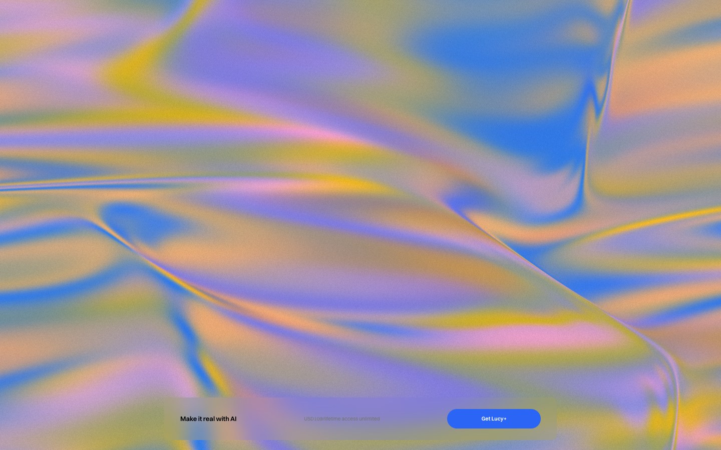
Liquid Gradient Background Blue Yellow Pink
Blue yellow pink liquid gradient background for landing pages, hero sections, and modals. Animated silk-flow mesh gradient in electric blue, warm yellow, and soft pink. Build with Claude Code, Cursor, Lovable, Codex, Replit, or Google Stitch. React, Tailwind, and WebGL source included.
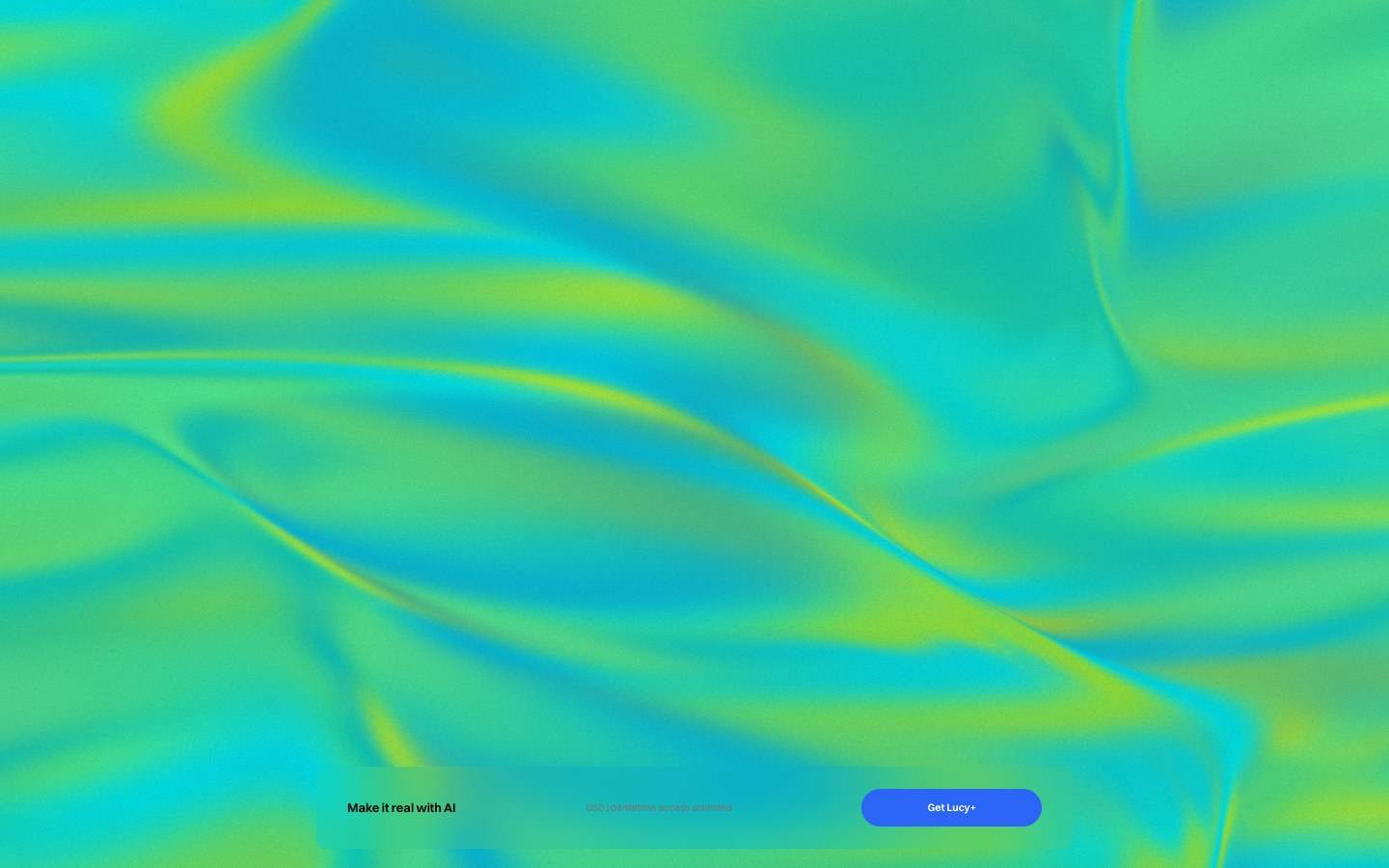
Liquid Gradient Background Green Teal
Green teal liquid gradient background for landing pages, nature-inspired product sites, and creative hero sections. Animated silk-flow mesh in electric teal, lime green, and cyan. Build with Claude Code, Cursor, Lovable, Codex, Replit, or Google Stitch.
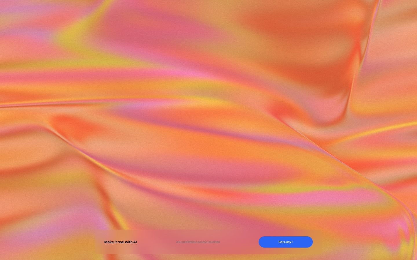
Liquid Gradient Background Orange Coral
Orange coral liquid gradient background for warm brand landing pages, fashion product sites, and bold hero sections. Animated silk-flow mesh in deep coral, golden orange, and warm pink. Build with Claude Code, Cursor, Lovable, Codex, Replit, or Google Stitch.
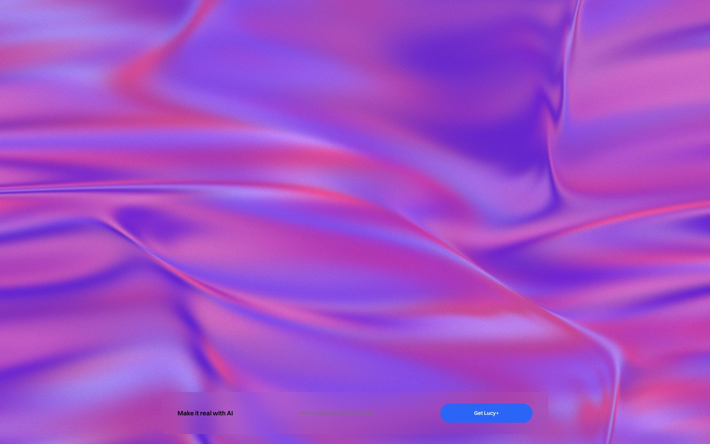
Liquid Gradient Background Purple Rose
Purple rose liquid gradient background for luxury brand pages, beauty product sites, and dark creative hero sections. Animated silk-flow mesh in deep purple, rose pink, and soft lavender. Build with Claude Code, Cursor, Lovable, Codex, Replit, or Google Stitch.
What can I build with website background effects?
Build:
- + liquid gradient backgrounds
- + aurora hero effects
- + ambient WebGL canvases
- + mesh gradient backdrops
- + animated hero backgrounds
- + pastel gradient animations
- + modal background effects
All components are built with React 18 and Tailwind CSS and can be customized using Claude Code, Cursor, Codex, Lovable, Replit, and Google Stitch.
About website background effects
Liquid gradient backgrounds, aurora hero effects, mesh gradient backdrops, and ambient background animations. Every component in this category ships with a live preview, copy-paste React and Tailwind source code, and the prompt that regenerates it in Claude Code, Cursor, Codex, Lovable, Replit, or Google Stitch.
Every component includes
- + A live preview of the exact section, screen, or animation
- + The prompt written for each of the 6 AI coding tools
- + Copy-paste React and Tailwind source code
- + Commercial usage rights
- + Implementation notes
- + Supported frameworks
Used inside
- + Landing pages
- + AI product websites
- + SaaS dashboards
- + AI chat apps
- + Startup websites
- + Portfolios
- + Marketing pages
- + Waitlist pages
React 18 and Tailwind CSS v3 assumed. Additional dependencies (framer-motion, gradflow) are listed on each component page when required.
Related prompts for website background effects
Frequently asked questions
Can I use this component copyright-free in my website or app?+
Yes. Every component, code file, and included asset on this page is free for commercial use with no attribution required. There is no license fee, no royalty, and no copyright restriction. Copy it, adapt it, ship it in client work, SaaS products, open-source projects, or internal tools — it is yours from the moment you copy the code.
How do I use this component in my project?+
Copy the source file from the "Copy code" button and save it into your components folder. Add any listed dependencies (React 18 or later and Tailwind CSS v3 or later are always required, plus framer-motion or gradflow if the component lists them). Import and render the component wherever you want it. Every prop is optional and defaulted.
Does this component work with TypeScript?+
Yes. Every component is written in TypeScript with fully typed props and exported interfaces. Paste it into a TypeScript project and it works without modification. If you need a plain JavaScript version, paste the file into Claude Code or Cursor and ask it to strip the types.
Can I customise this component for my brand?+
Yes. Every component uses Tailwind utility classes throughout and accepts content props (headline, subtitle, image URL, CTA, and so on). Change the brand color in one place and every CTA updates. Swap the font in next/font and every heading updates. For structural changes, paste the prompt into Claude Code, Cursor, Lovable, Replit, or Codex and describe your brand tokens, spacing, or motion preferences.
Will this component slow down my page?+
No meaningful impact. Components that animate use CSS transforms, which are GPU-composited and do not trigger layout. Components that scroll-drive use a lightweight IntersectionObserver or useScroll hook — no polling or continuous repaints. The Tailwind output is tree-shaken at build time so no unused styles ship. Total JavaScript added per component is under 2 KB gzipped in most cases.
Can I use this with shadcn/ui or other component libraries?+
Yes. These components are standalone: no shared context, no global CSS, no conflicting reset. They use Tailwind utility classes and standard React hooks, which are compatible with shadcn/ui, Radix UI, MUI, and any other component library. Import them alongside your existing components without conflicts.
Are the components free for commercial use?+
Yes. Everything on this page is free to copy, adapt, and ship in commercial projects. No attribution required. If you post a public showcase we always appreciate a link back.
Which AI coding tool works best for these components?+
All five prompts produce the same design. Claude Code and Codex are best when you want the component slotted into a project with existing conventions. Cursor is ideal for editing inside your IDE with the file open. Lovable and Replit spin up a fresh preview fastest, useful for a quick play.
Do these work with Next.js, Vite, and Remix?+
Yes. The source files are plain React 18 client components. They run on any framework that supports React 18 and Tailwind CSS v3. If a component needs the "use client" directive (all of them do here, since they use hooks), keep the directive at the top of the file when you paste.