

18+ Parallax and scroll React components with AI prompts
Parallax hero sections, sticky scroll cards, Ken Burns pans, word-by-word text reveals, blur-to-focus scroll effects, and Apple-style expanding heroes. Copy the React and Tailwind source, or paste the prompt into Claude Code, Cursor, Codex, Lovable, or Replit to rebuild each one in your own project.
by the same hand.
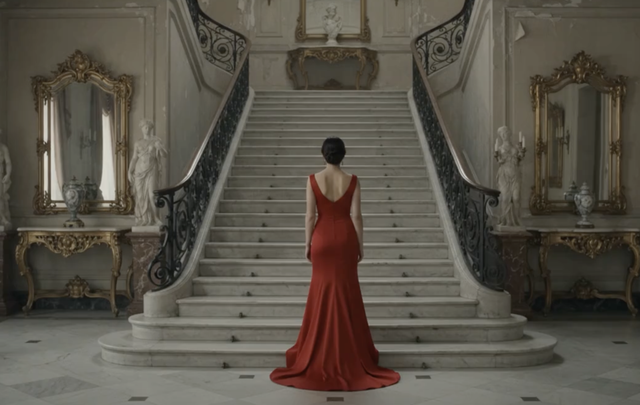
Parallax Storytelling Hero Section
Full-screen parallax hero section for React, cinematic image reveal on scroll with a single big headline per panel.
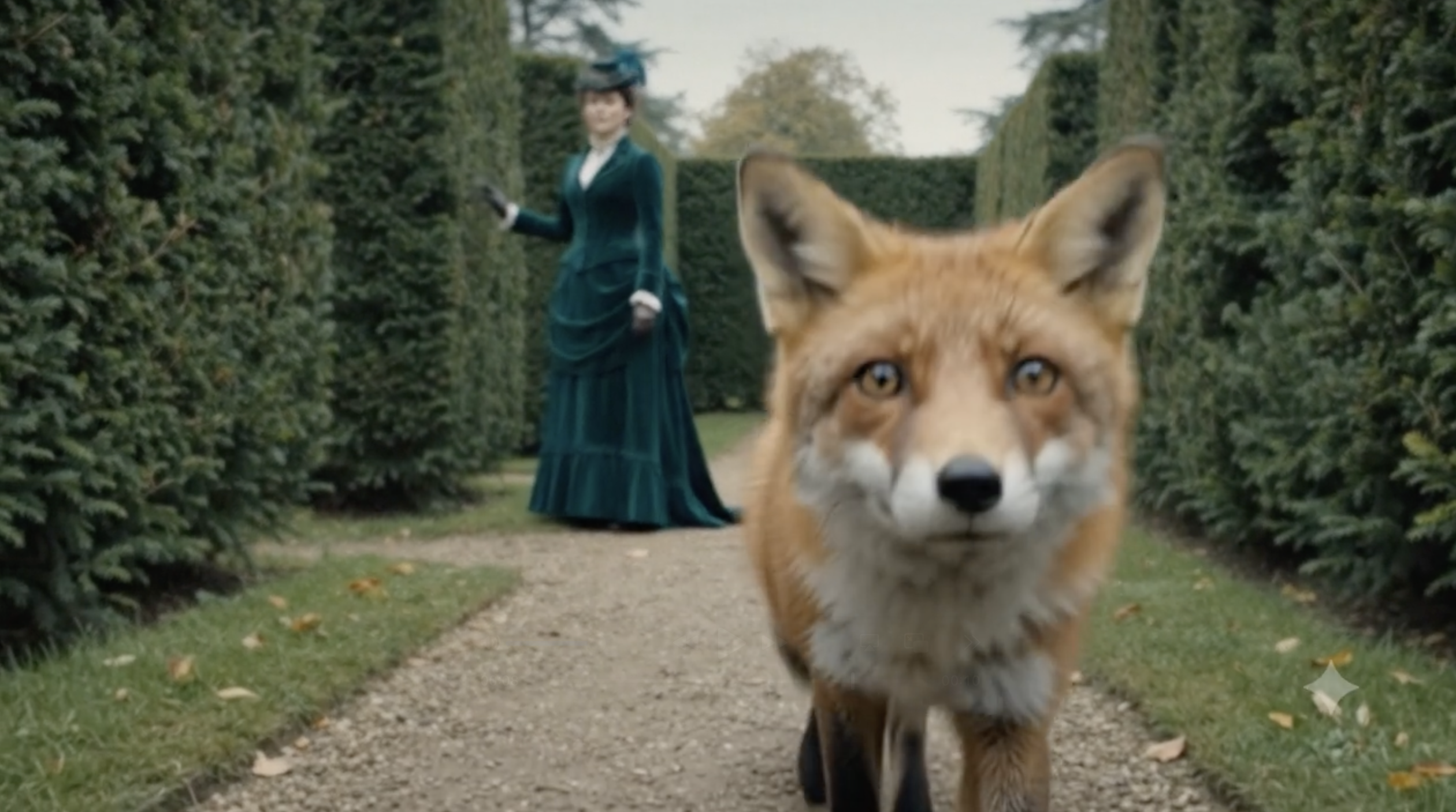
Sticky Scroll Stacked Cards Section
Sticky scroll cards for React feature sections, Apple-inspired stack layout where each card pins as you scroll.

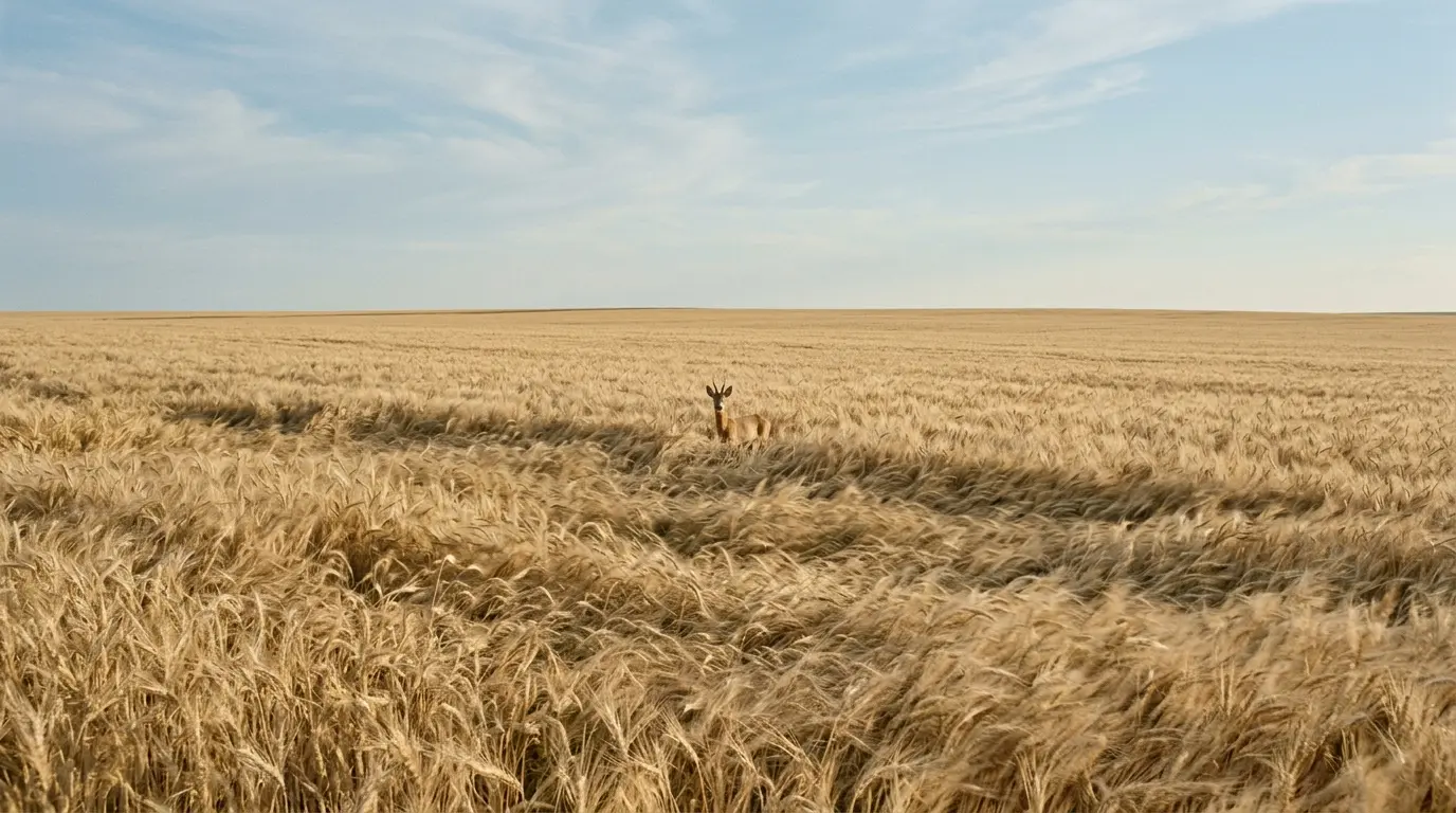

3D Parallax Depth Hero Section
3D parallax depth hero for React, image layers recede on scroll while the headline scales up and pushes forward.

Expanding Clip Scroll Hero (Apple-Style)
Apple-style expanding scroll hero for React: image opens from a small card to full-bleed with a cross-fading text sequence.
Reverse Zoom Scroll Hero (Full-Bleed to Card)
Zoom-out scroll hero for React, full-screen image shrinks into a rounded card as the reader scrolls, closing content fades in.
Pinned Text Sequence Scroll Hero (Product Story)
Apple product-story scroll hero for React: cross-fading headlines over a fixed full-bleed image, ending in a CTA.
Horizontal Split Panels Scroll Hero
Split panel scroll hero for React, top and bottom images part on scroll to reveal centered headline, subtitle, and CTA.
Wide by design.
Ken Burns Slow Pan Scroll Hero
Cinematic Ken Burns scroll hero for React, slow horizontal image pan with bottom-left headline. Editorial pacing.

Ascending Image Slide-Up Hero (Type-First)
Type-first scroll hero for React: starts as headline on white, image slides up as text transitions to white.
Zoom Out Reveal Scroll Hero
Zoom-out reveal scroll hero for React, extreme close-up image expands on scroll to reveal the full scene.
Vertical Split Scroll Hero
Vertical split scroll hero for React, left and right image panels part on scroll to reveal centered content between them.
Blur to Focus Scroll Hero
Blur-to-focus scroll hero for React, image sharpens as the reader scrolls with a cross-fading headline pair.
Sticky Text Marquee Hero
Sticky small-headline hero for React with a soft marquee line drifting horizontally in the background.
A quieter workspace where every model listens, remembers, answers as you.
Word-by-Word Text Reveal Scroll Hero
Scroll-driven word-by-word text reveal hero for React, small headline that arrives one word at a time.
The best AI product is the one you stop noticing.
We built this for the writer at 6am, the designer between meetings.
Sticky Kicker Manifesto Hero
Sticky top-of-page kicker label for React manifesto pages, updates its text as reader scrolls sections.
“The best AI is the one you stop noticing.”
Sarah C. · Product
Pull Quote Testimonial Hero
Editorial pull quote hero for React, sticky testimonial at a small display size over a full-bleed image.
The last time you built a landing page,
you probably wrote the copy in a doc,
imagined the layout on a whiteboard,
and asked five tools to help you.
Line-by-Line Text Reveal Scroll Hero
Scroll-driven line-by-line text reveal hero for React essays and story openings.
Sticky Split Text Scroll Hero
Scroll-driven split text hero for React, two-half headline parts on scroll to reveal a subtitle.
About scroll & motion components
Scroll-driven sections, parallax, sticky reveals, and cinematic sequences with polished motion timing. Every component ships with a live interactive preview, a copy-paste React and Tailwind source file, and the prompt that rebuilds it in Claude Code, Cursor, Lovable, Replit, or Codex.
React 18 and Tailwind CSS v3 assumed. Additional dependencies (framer-motion, gradflow) are listed on each component page when required.
Related prompts for scroll & motion
Frequently asked questions
How do I use this component in my project?+
Copy the source file from the "Copy code" button and save it into your components folder. Add any listed dependencies (React 18 or later and Tailwind CSS v3 or later are always required, plus framer-motion or gradflow if the component lists them). Import and render the component wherever you want it. Every prop is optional and defaulted.
Can I customise the design and copy?+
Yes. Every component takes props for its content (headline, subtitle, image URL, CTA, and so on) and uses Tailwind classes throughout, so you can restyle without touching the logic. For deeper design changes, paste the prompt into Claude Code, Cursor, Lovable, Replit, or Codex and describe your brand tokens, spacing, or motion tweaks.
Are the components free for commercial use?+
Yes. Everything on this page is free to copy, adapt, and ship in commercial projects. No attribution required. If you post a public showcase we always appreciate a link back.
Which AI coding tool works best for these components?+
All five prompts produce the same design. Claude Code and Codex are best when you want the component slotted into a project with existing conventions. Cursor is ideal for editing inside your IDE with the file open. Lovable and Replit spin up a fresh preview fastest, useful for a quick play.
Do these work with Next.js, Vite, and Remix?+
Yes. The source files are plain React 18 client components. They run on any framework that supports React 18 and Tailwind CSS v3. If a component needs the "use client" directive (all of them do here, since they use hooks), keep the directive at the top of the file when you paste.