

35+ React and Tailwind components with the prompt that built each one
Hero sections, sticky card layouts, AI chat interfaces, aurora backgrounds. Copy the source, or paste the prompt into Claude Code, Cursor, Lovable, Replit, or Codex to rebuild it in your own project.
by the same hand.
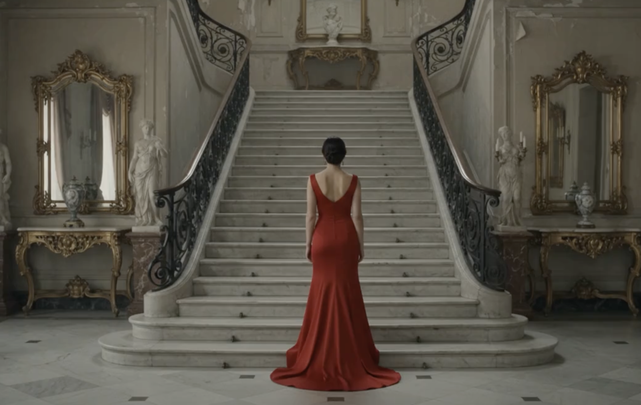
Parallax Storytelling Hero Section
Full-screen parallax hero section for React, cinematic image reveal on scroll with a single big headline per panel.
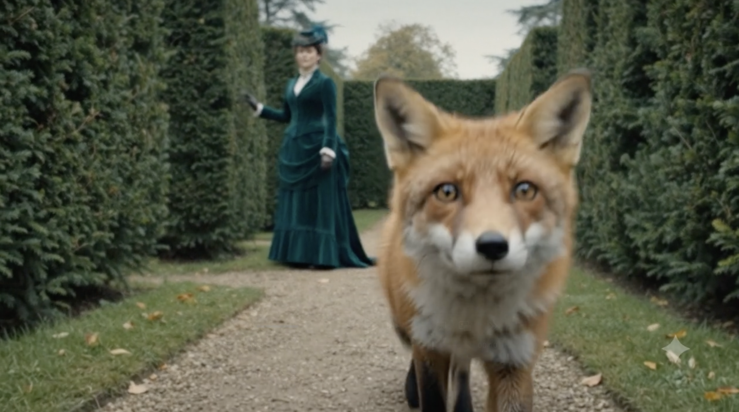
Sticky Scroll Stacked Cards Section
Sticky scroll cards for React feature sections, Apple-inspired stack layout where each card pins as you scroll.
to build.
Apple-Style Product Hero Section
Minimal Apple-style product hero for React landing pages: display headline, one-line subtitle, two text links.
AI Chatbot Chat Interface
AI chatbot interface for React and Next.js apps: streaming messages, growing input, suggestion chips, and blinking cursor.

Liquid Gradient Background
Animated liquid gradient background for React hero sections, empty states, and modal backdrops. WebGL, mesh-style flow.

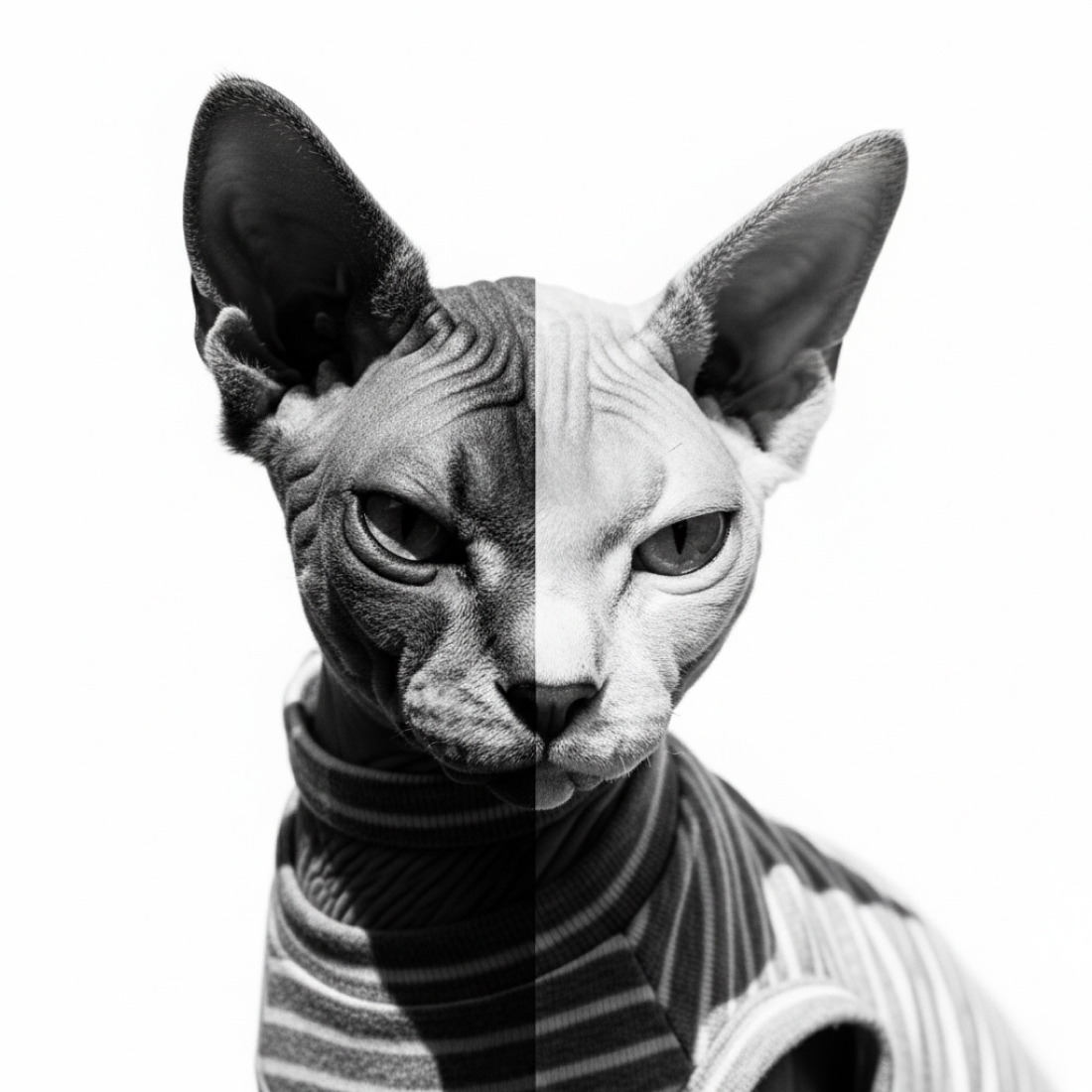








Orbit Image Gallery Hero Section
Circular image orbit hero section for React, gallery of cards around a centered headline with 3D flip hover animation.

3D Parallax Depth Hero Section
3D parallax depth hero for React, image layers recede on scroll while the headline scales up and pushes forward.

Expanding Clip Scroll Hero (Apple-Style)
Apple-style expanding scroll hero for React: image opens from a small card to full-bleed with a cross-fading text sequence.
Reverse Zoom Scroll Hero (Full-Bleed to Card)
Zoom-out scroll hero for React, full-screen image shrinks into a rounded card as the reader scrolls, closing content fades in.
Pinned Text Sequence Scroll Hero (Product Story)
Apple product-story scroll hero for React: cross-fading headlines over a fixed full-bleed image, ending in a CTA.
Horizontal Split Panels Scroll Hero
Split panel scroll hero for React, top and bottom images part on scroll to reveal centered headline, subtitle, and CTA.
Wide by design.
Ken Burns Slow Pan Scroll Hero
Cinematic Ken Burns scroll hero for React, slow horizontal image pan with bottom-left headline. Editorial pacing.

Ascending Image Slide-Up Hero (Type-First)
Type-first scroll hero for React: starts as headline on white, image slides up as text transitions to white.
Zoom Out Reveal Scroll Hero
Zoom-out reveal scroll hero for React, extreme close-up image expands on scroll to reveal the full scene.
Vertical Split Scroll Hero
Vertical split scroll hero for React, left and right image panels part on scroll to reveal centered content between them.
Blur to Focus Scroll Hero
Blur-to-focus scroll hero for React, image sharpens as the reader scrolls with a cross-fading headline pair.
Sticky Text Marquee Hero
Sticky small-headline hero for React with a soft marquee line drifting horizontally in the background.
A quieter workspace where every model listens, remembers, answers as you.
Word-by-Word Text Reveal Scroll Hero
Scroll-driven word-by-word text reveal hero for React, small headline that arrives one word at a time.
The best AI product is the one you stop noticing.
We built this for the writer at 6am, the designer between meetings.
Sticky Kicker Manifesto Hero
Sticky top-of-page kicker label for React manifesto pages, updates its text as reader scrolls sections.
“The best AI is the one you stop noticing.”
Sarah C. · Product
Pull Quote Testimonial Hero
Editorial pull quote hero for React, sticky testimonial at a small display size over a full-bleed image.
The last time you built a landing page,
you probably wrote the copy in a doc,
imagined the layout on a whiteboard,
and asked five tools to help you.
Line-by-Line Text Reveal Scroll Hero
Scroll-driven line-by-line text reveal hero for React essays and story openings.
Sticky Split Text Scroll Hero
Scroll-driven split text hero for React, two-half headline parts on scroll to reveal a subtitle.
Scroll Progress Bar (Top of Page)
Fixed top scroll progress bar for React and Next.js pages, tracks page scroll with a thin coloured line.
Reading Progress Rail (Sidebar with Read Time)
Floating reading progress rail for React article pages, shows percent complete and estimated read time.
Sticky Table of Contents Sidebar
Sticky React table of contents sidebar for long-form articles, highlights the active section as reader scrolls.
Onboarding Progress Bar (Multi-Step Numbered)
Multi-step onboarding progress bar for React signup flows, product setup wizards, and checkout funnels.
Ship 10 more prompts to reach Level 4.
XP Progress Bar (Gamification Level Card)
XP progress bar card for React gamification: shows level, XP, and progress to the next level.
Circular Progress Ring (SVG Percentage)
Circular SVG progress ring for React dashboards, stat cards, credit usage, and generation status tiles.
Leaderboard Row (Ranking with Change Indicator)
React leaderboard ranking list for gamification apps, shows rank, name, points, and up/down change.
Actions
Command Palette (⌘K Search Modal)
⌘K command palette React component with search, keyboard navigation, and grouped results.
Bento Grid Feature Section (Vercel-Style Landing)
Vercel-style bento grid feature section for React landing pages, varied card sizes with clean spacing.
Copilot
Ask about anything
AI Copilot Sidebar (Right-Panel Assistant)
AI copilot sidebar panel for React and Next.js apps, slides in from the right with quick actions and chat input.
Masonry Image Grid (Pinterest-Style Multi-Column Gallery)
Pinterest-style masonry image grid for React portfolio pages and gallery landing sections.
Tilted Card Fan Gallery (Hover to Lift)
Tilted card fan React gallery hero with hover-to-lift interaction, 4-6 image cards fanned out.
Chapter oneChapter twoVertical Portrait Parallax Gallery (Editorial Image Stack)
Vertical portrait parallax gallery for React editorial pages, stacked panels with gentle scroll offset.
TLDR
Every component gives you three things: a working React and Tailwind source file, a live interactive preview, and the prompt that rebuilds it in Claude Code, Cursor, Lovable, Replit, or Codex.
React 18 and Tailwind CSS v3 assumed. A few components use framer-motion for scroll motion, listed on each page. Categories cover scroll and motion, landing sections, AI chat interfaces, and ambient effects.
Frequently asked questions about AI Library
What do I get on each component page?+
A live interactive preview you can click through, a copy-paste React and Tailwind source file, and the prompt that rebuilds the component in Claude Code, Cursor, Lovable, Replit, and Codex. You can copy the code or copy the prompt.
Are the components licensed for commercial use?+
Yes. Every component on this page can be copied, adapted, and shipped in commercial projects with no attribution required.
What frameworks do these components support?+
All components run on React 18 or later and Tailwind CSS v3 or later. A few components use framer-motion for scroll-driven motion, listed on each component page.
Why include a prompt if the code is already here?+
The prompt lets you regenerate the component in your own codebase, matched to your design tokens, brand color, or file structure. Faster than editing someone else's file. Every prompt is written specifically for Claude Code, Cursor, Lovable, Replit, or Codex.
Which AI coding tool works best for these components?+
All five prompts produce the same design. Claude Code and Codex are best for full projects with existing conventions. Cursor is ideal if you are editing inside your IDE. Lovable and Replit are best if you want to spin up a fresh preview quickly.